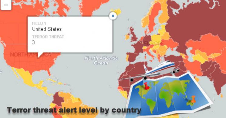
Is it safe to travel? What does the terror threat around the world look like? It's not like you can pull out your paper McNally map and get this crucial information! Even Google maps does not give you a good idea if you should be loading up on that travel insurrance before leaving home.
This open street map give you exactly what you need to assess the risk of travel to any part of the world. Belgium was just one of 40 countries around the world where the threat level was "High" by the Foreighn Office and as shown in the map the countries in dark red have a "high" terror threat level, the ones in red are a "general" threat while the ones in orange are "underlying" and yellow are "low".
I am personally heading to Paris soon so my insurance is on the "high" side. I think we all look forward to the day that the map is mainly yellow with a dash of orange and occasional spot of red only...
Are you travelling any time soon? Any dark red regions in your plans? Click or search on the map below to find out.
Also don't forget... Leave a comment below.
Interactive Threat Level Chart : Click on any country to obtain the corresponding Threat Level.
Read more by Goldzilla